“In this space, all the stories are alive.”
In Conversation with Thea Mantwill and Jana Buch about Reading (in) their Literary Exhibition 13 Morgen


Literary reading and writing are not only the domain of authors, literary scholars, creative writing instructors and publishing professionals. It is also—and has been for quite some time—alive and thriving in the context of art. A recent example is the literary exhibition 13 Morgen [13 Mornings], displayed at Kunst im Tunnel (KIT; ‘Art in the tunnel’) in Düsseldorf from March until June 2023. The two artists and authors behind the exhibition are Thea Mantwill and Jana Buch, both based in Düsseldorf. Thea and Jana studied at Kunstakademie Düsseldorf and focused on poetics and the art of book design in their studies. Prior to 13 Morgen, they worked with literary texts, the medium of the book, and installations framing their texts in previous projects. In our conversation, Thea and Jana unpack how 13 Morgen plays with space, time, and media of reading. They make clear how reading at the museum can help to explore and reflect on (new) reading practices.
_Reading at the Museum
13 Morgen invited visitors to read in a public space. For many of them, the museum likely formed an unusual environment for reading. A museum differs from designated reading spaces like libraries or domestic settings where readers can easily find a comfortable position, for example curling up with a book on a couch. Preparing the exhibition, Thea and Jana had asked themselves how they could make their texts approachable and how they could make KIT a place in which visitors would be willing to read.
Sonka Hinders (SH): Which challenges did you face bringing literature and reading into a museum?
Jana Buch (JB): Visitors’ expectations and patience. Most people know exhibition texts only as archival materials, explanatory notes on walls, or subtitles in video installations. Patience is a problem because there’s a common misconception about what a text should do for you, and what you have to do for the text, giving it time, attention, focus. A common attitude in the art context is that when you look at a painting, it has to touch you or be beautiful. You have to put more work into reading a text because you were taught, for example at school, that a text demands something from you. You can’t immerse yourself in the text just like that and you have to show some initiative. That’s why I think people are less patient and more interested in visual input and aesthetics than in reading when they visit an exhibition.
Thea Mantwill (TM): Sometimes visitors are confronted with perceived expectations of how they should behave or how they should understand the exhibition.
JB: Or which objects they’re allowed to touch.
TM: It was important for us to create a low threshold, so that visitors don’t think they need to have read Deleuze or Goethe to be able to open a book in the exhibition. It was important for us to present different text forms and create playful impulses, so that visitors could find out which texts they find interesting.
SH: You moved reading, which is often understood as a solitary practice, to a public space. What fascinates you about public reading and inspired you to work with it?
JB: We tried to create spaces which were simultaneously open and intimate. We looked at libraries and reading rooms as spaces in which readers are not too isolated and not startled when someone interrupts them. We also decided to limit the number of copies available of the texts on view. It’s not about having 30 people sit in a row and concentrate on who the fastest reader is, which can happen. We always put out two or three books. Visitors can have an individual, intimate reading experience and nevertheless share it with others.
TM: It’s also important how you can position yourself while reading. I prefer corners, I would never sit down in the middle of a room. So it’s important people can feel like they’re in the right place to read. They could take one of the publications and sit down somewhere else, wherever they wanted, and many people did just that. They could also talk with others about the texts. There were some areas with two or more chairs where visitors could start a conversation or look at texts together. But there was still enough space that they didn’t have to stick closely to a stranger reading the same text.
SH: Most of your texts were only available to read in the exhibition, so you had to be in the museum space and couldn’t read them anywhere else. [1] How did this exclusivity affect reading?
JB: The reason for this was quite pragmatic. Producing books is extremely expensive and we didn’t have the budget to publish all of our nine books. The effect on reading was that it created some pressure, of course. It played a huge role that visitors couldn’t take the texts home, and it was an interesting point of discussion for us. One option was to put all texts on the exhibition website. But this availability would have brought about a low appreciation of reading and writing with it, so we decided against it.
TM: If I were a painter, I wouldn’t print all of my works on expensive canvas screens for visitors to take home.
JB: What happens to reading is something that happens in every other art exhibition as well. People go there, experience the exhibition, maybe take the catalogue home with them, but it can only refresh their memories. The exhibition space we designed hopefully allowed visitors to focus and treat the texts observantly. If they had the texts at home, they would maybe not read them in that way, but just own the texts without being forced to really examine them. In the exhibition space, reading can happen. In this space, all the stories are alive. It’s a form of appreciation which can only occur there.
_Space
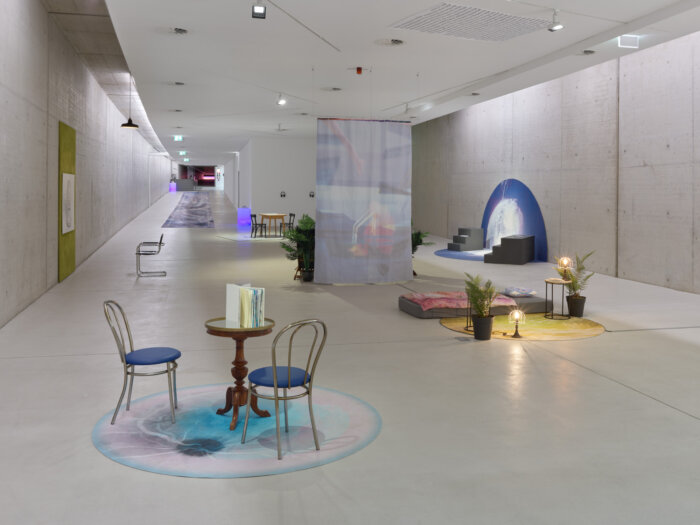
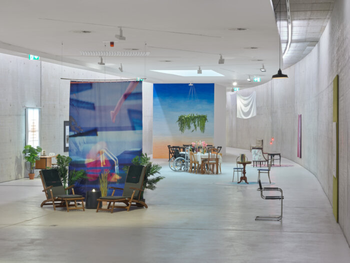
Thea and Jana designed the exhibition space of 13 Morgen as a house with different rooms, all of which were assigned a text. The house’s fictional owner, a grandmother, appeared in the prologue and the epilogue of the exhibition. She told visitors that she was on a ship, maybe on her final journey. The idea of a house which was (in some sense) also a ship matched KIT’s architecture. As a remainder of a tunnel near the river Rhine, the exhibition space was shaped like the stretched out hull of a ship. Space in 13 Morgen was thus not only significant in terms of the museum as a place hosting the visitors’ reading experiences, but also on further levels of the exhibition.

SH: As you already mentioned, you studied libraries and reading rooms for the exhibition. Which features of these places did you transfer to it?
TM: Definitely the possibility to let your gaze wander. You do not only take in the immediate surroundings framing the respective text, but you can also look around and not only see KIT’s concrete walls. That’s how we came up with large colorful surfaces or with rooms mirroring the outside world, such as the garden. We realized that areas needed to have a specific size, approximately 2×3 meters, so that the exhibition space didn’t become too cramped and visitors lose their focus of attention. Then there was the question of how you sit, at different tables, in different rooms. Should people sit across from each other, sit in a lower position? Where will they sit down for a longer time? Should the sitting position be comfortable or not? The space we labeled the staircase is quite uncomfortable, for example, because its text is a bit uncomfortable. We also put quite a lot of thought into the garden because it’s logical to put up garden chairs and that’s what we ended up doing. But before that, we asked ourselves: How long can you sit down in such a chair? Will it be uncomfortable if you spend a longer time reading in it? But people who have problems sitting down had many other opportunities to find a comfortable seat.
JB: The German video artist Hito Steyerl develops installations with special seats for each of her works, so that the installations become part of the video, part of the way it is staged. In exhibitions, video art has similar problems as literature because it is time-based, and reading a text also takes time. This also guided us in reflecting on the settings in which it is easy for us to read. For me, for example, libraries are way too quiet and I feel like I’m being watched.
SH: So you, Jana, say that libraries are not ideal reading spaces for you personally. Which other places did you channel into the exhibition that might not necessarily be typical reading spaces?
TM: The bathroom in the exhibition was inspired by swimming pools and saunas because I always enjoy reading there. You can relax and lie down halfway, but not completely because then you fall asleep. In the exhibition you needed some support from your surroundings and from others to have this experience. It’s hard to relax on one of the bathroom’s deck chairs when a person in a really formal suit walks past you.
JB: I don’t think I added that many other places. For me, it’s easy to read outside, on the beach, in the park, at the pool. Maybe even in cafés, but there can be distraction because of background noises or people you meet. Trains are great. We didn’t use a train as a backdrop for the exhibition, though, but the attic we included might have been a bit similar in the way that it was almost cozy. So, generally I think these small things are more significant than concrete situations. The qualities of a chair are more central than setting up an entire swimming pool.
SH: Let’s talk about the spaces you created within the exhibition in more detail. On a superordinate level, you conceptualized the exhibition as a ship and a house. To me, a ship represents a journey between different places, and a house an arrival, being at home. Is this alternation between traveling and arriving also part of how you understand reading?
TM: I think this aspect became part of the installation because we thought about how we could make people feel comfortable. Sometimes books or stories can be distressing and you’re exhausted after reading them or you can’t get certain aspects off your mind. And then you begin to take a look around your environment again. It’s kind of a dreamy state of mind, and you need a safe environment to arrive in, returning from the text.
JB: Some of the texts had quite strong emotional effects, so creating intimate spaces was important. The bedroom in the exhibition is a good example. To most people, it’s probably obvious that a bedroom has a specific context, the need to feel secure and protected, for example. And that’s also what the book in the bedroom was about. So, both of these aspects are connected. You need a space where you can settle down to engage with a text that covers complicated topics.
SH: A space’s atmosphere affects reading processes. How did you conceptualize the interactions between atmosphere and reading in the different rooms of the house?
JB: Atmosphere was essential for all of the rooms. The kitchen, for example, should be chilly, direct, almost like the setting of a cross-examination. People sat across from each other and then there was a negotiation. The cellar should be narrow and low. In the study, we wanted to include a window to create a cozy workplace which still made it possible to focus. The staircase had these uninviting, hard steps. The attic opened up towards the ceiling, so that it was not a dark, creaky attic, but something lighter, because it was located in a corner of KIT which can be claustrophobic.
_Time
There was no specific chronology in which readers had to visit the rooms of 13 Morgen and read the texts, apart from the prologue and epilogue framing the exhibition. Visitors were free to choose in which order and for how long they read. Reading time, especially its linearity and duration, was flexible.
SH: The fact that readers could choose in which order they read texts and for how long they read them brings up questions of completeness. They might not have looked at all texts. What’s your attitude towards these incomplete reading practices?
JB: It’s completely understandable.
TM: We haven’t even managed to read all of each others’ texts that were included in the exhibition.
JB: It’s too much. Our idea was that people could come back to the exhibition later. They could have their names written down at the entrance and then reenter later if the exhibition was about to close, if people had appointments, if they couldn’t focus anymore, whatever. It was clear to us that it might not be relevant for people to see everything or read everything. And the funny thing is that it’s the same in every other exhibition you’ll ever visit. After walking through an exhibition with landscape paintings, you won’t remember whether a bird was painted in the upper left-hand or upper right-hand corner of a painting. This connects to my earlier point that there are different expectations with text and language, because for paintings it’s not relevant whether a chimney produces smoke or not.
TM: …or if you spent the same amount of time looking at each of the paintings.
JB: This is where we can apply ideas from art exhibitions. We can let people take the time they have to connect with the works, instead of saying it’s a literary event, we’ll do a reading from 7–9 pm, then answer some questions, and then we’ll all go home.
SH: One text in the exhibition that I found especially striking in this context is “Glühfarbe.” It’s 114 pages long, so it’s quite unlikely that people read it completely. Why did you nevertheless decide to include “Glühfarbe” in the exhibition?
TM: On the one hand, because I wrote it for this purpose and because I like it. On the other, I also exhibited a book that was 108 or 112 pages long when I graduated from Kunstakademie, and I didn’t expect anyone to read all of it, but some people did. So I thought, people can just open “Glühfarbe” and read parts of it, or come back later and continue. It was important for me to show the story to others, and especially for this text I would like to find a publisher, so more people can read it outside of the exhibition.
JB: Talking about reception so much in this conversation, we have to stress that we have certain standards of our own for our works. I wouldn’t rewrite my texts for the audience expected to arrive at the exhibition. Not presenting a text because it’s long would conflict with your own artistic practices if it needs the length to be consistent and to fulfill your own expectations. You have a feeling for the right length. The text is consistent when you feel that way, not when it has 50 pages or more. So, this is where we are, again, influenced by writing, but also by the arts. It’s like saying an artist has used too many colors in a painting, but this can’t be the case. The painting is finished when it looks finished.
TM: And people read in the weirdest ways that we probably can’t even imagine.
JB: True, from the end to the beginning. It’s something we don’t have power over. It’s possible that someone only reads the first ten pages and then skips a couple of them or briefly leafs through the rest to get an overall impression. Because of this, it’s a main concern for us that the story feels right. And finding a publisher, as Thea plans to do for “Glühfarbe,”would give us more time to continue working on ideas in the text we couldn’t fully explore so far.
TM: …and the chance to gain more readers.
SH: A further way in which you addressed the notion of time in the exhibition is by adding specific years as settings to the texts. Was it also a possibility to read the text in the chronological order of these dates?
JB: The dates were symbolic. I would really have to think about what sequence emerges from them. But because we didn’t have any rules concerning chronology, it would have been totally fine to follow the chronological order of the dates.
TM: It would have probably been a bit of a ping-pong feeling. One example which illustrated the idea of symbolic dates was the bedroom where I chose 2018 as a date. That was the time when the #MeToo movement started in the US, which addresses a similar theme as the bedroom’s text.
JB: All the dates in the exhibition covered a period of 100 years. It was a metaphorical representation of the grandmother’s life, who appeared in the prologue and epilogue. She was on a ship in a dystopian, but not so distant future, in 2052, where the world has been flooded.
TM: When you read, you can encounter experiences you don’t know from your personal life. There exist way more experiences than you can personally get to know in your life. Because of this, we thought that moving around between different points in time, between different bodies, societies, and so on, in the reading process resembles a long journey. But maybe it’s also a bit naïve that we used dates from a time span of 100 years which we can’t really have an overview of.
_Media
As an underground exhibition space with concrete walls, KIT only offers limited cell phone reception to its visitors. Even though Thea conceded that she still hoped 13 Morgen was instagrammable, the lack of reception also had some advantages for Thea and Jana. It contributed to creating a space without digital distractions, often viewed as obstacles to reading. While Thea and Jana presented many texts in 13 Morgen as books with special designs, the exhibition also featured texts in the form of audiobooks and readable objects such as plates, posters, bed sheets, carpets, and flags. In the context of 13 Morgen, Thea and Jana did not only have to handle digitality. They also had to consider media representations of their texts in general.
SH: Throughout the last years, various digital reading tools have been developed. You didn’t include any of them in the exhibition. Was it a conscious decision of you not to work with digital texts?
TM: For me, reading is clearly connected to the format of the book. It’s easier for me to focus. As soon as I get close to any kind of digital surface, I’m even more easily distracted than I usually am. I never read digital texts, which also has to do with the fact that I have eye problems and try to have as little screen time as possible.
JB: I think for me it’s a bit different. I also like reading physical books. I don’t have an e-reader or tablet, so I’m not really sure if that would be something for me, but generally, I think I would be willing to try. I’m struggling with the idea that one thing excludes the other. I have a background in photography and there was a time when people said analogue photography would be destroyed by digital photography and that there wouldn’t be photographs anymore. That’s similar to how people now say there won’t be any books anymore.
TM: …which is nonsense, there will be more special books instead.
JB: But when we set up an exhibition, we work with an attention economy, and if you put an iPad in there, you know where all the visitors will end up going.
TM: It’s associated with entertainment in a stronger sense, even though reading can also be entertaining, of course.
JB: But it’s a glowing screen and we’re all a bit like moths. It’s completely normal that you go and look at it. We never talked about it in that much detail, but we knew that any digital element would turn into the main point of attraction. And then we would have had to design the entire exhibition in that way. There are many digital texts and art forms. I wouldn’t say that I’m against them, but if we had wanted to include them, I would have had to study digital text production and to find out how to work with it. Do I use VR glasses? Do visitors walk through a room made of text?
TM: It’s a completely different medium. Our professor John Morgan at Kunstakademie taught us how to work with books or print texts. Digital texts have completely different fonts and designs. There’s very little you can directly transfer from one to the other.
SH: Which design features did you pay most attention to while designing the books for the exhibition?
JB: For me it’s always been a challenge to stop being afraid of only having a few lines, few letters on the page, and a lot of white space. When I graduated from Kunstakademie, I tried to have as much clarity in the design of my final project as possible. I came across a book by the poet and choreographer Yvonne Rainer and loved it. She worked with few lines of text and the book is a bit too large compared to ‘normal’ formats. Its take-away, for me, is that the design should give the text room because Rainer’s texts are unwieldy and short and they’re allowed to have this space. Now I keep using her book as a reference. That’s what guided my page design and typography. I frequently look into book formats that I like and use them. The book “Das Rot der Tomaten” in the exhibition’s kitchen, for example, had the format of a Suhrkamp Wissenschaft book. And “Grüne Gischten,” which has drawings in it, was based on a book by one of my former professors, turned into a landscape format. I’ve used it before for a different publication, and I think it’s a cool format because it’s a bit weird. Designing covers is always a huge drama for me, I’m not good at it. With “Das Rot der Tomaten” it was an obvious choice to put a tomato on it. I wanted it to be a little red book, it’s political. There was a photo of a tomato on it with a small cut. That was a perfect match for me. So, the main points for me are clarity and peace. The texts were crazy enough in themselves.
TM: In my case, the texts and their forms vary a lot sometimes. I usually ask myself: What kind of book would I like to hold in my hand? I do also look for models that can serve as references, but first I reflect on what would be a good fit, especially in dialogue with the text’s contents. “Izzy” for example is about a child that isn’t treated well in the course of the story. My idea was that in contrast to the abuse the child experiences in the book, the book itself should be small and precious. I’ve always wanted to create a Hanuman book, a small book, and this was a perfect opportunity. It was also a good excuse to bid on a Hanuman book on Ebay, and so I bought one of them. It’s a series of books published in New York in the ‘50s or ‘60s. They are religious books, I think, focusing on Buddhism.
JB: The size resembled that of a cassette tape, I think.
TM: It was even a bit smaller. Then I wanted “Glühfarbe” to be a hardcover book because it’s a short novel and my first long fictional story. I also made the book white and decided not to have a protective foil, so that it quickly becomes dirty and worn out. These features are connected to the liminal state described in the text and to its genre of a female artist’s novella. There are a lot of artists’ novellas which are written by or represent black-clad men from the middle and upper class who can afford to be melancholic. These books are often connected to the idea of a certain genius. They really annoy me, so it was important to me that my book was first white and then dirty. On the cover you could see something that was related to the title. There’s me, forging a ring with my sister, but you can only see the ring and the flame. I just cut out the photo in Photoshop and put it on the cover. My sister said I had to look at the smoldering color (‘Glühfarbe’) because otherwise the ring would melt. But she couldn’t explain to me what color that was supposed to be and I ended up melting half of the ring, but we managed to fix it in the end. I thought ‘Glühfarbe’ is a great word to describe this liminal state where you don’t know what’s going to happen.
It was a similar atmosphere of surprises that visitors of 13 Morgen could experience throughout the entire exhibition. Visitors could dip into texts that differed widely in their themes as well as literary and medial forms. This versatility offered readers new things to discover from the beginning to the end of the exhibition. The great variety of texts did not only enable visitors to consider which kinds of texts they prefer to read; they also had the opportunity to reflect on their reading habits and explore different reading practices: What does it feel like to read at the museum instead of in bed at home? Is sharing impressions of reading with other visitors enjoyable or do I prefer solitary reading? How do book covers, shapes, and typography influence which texts I pick up? Can I relax reading Thea’s text “The Club” on a deck chair, next to a water fountain, or does the text depict wellness in a spatial setting that haunts me? Does reading Jana’s “Das Rot der Tomaten” bring up fond memories of my time as a student or do its aphoristic texts make me long for ideas I have never had? 13 Morgen enriched understandings of reading by creating memorable moments of the different reading worlds visitors entered in its exhibition space.
_How to Cite
Sonka Hinders. “‘In this space, all the stories are alive.’—In Conversation with Thea Mantwill and Jana Buch about Reading (in) their Literary Exhibition 13 Morgen.” On_Culture: The Open Journal for the Study of Culture 16 (2024). <https://doi.org/10.22029/oc.2024.1405>.

_Endnotes
- [1] For the exhibition catalogue, including excerpts from the exhibition’s texts, see https://kunst-im-tunnel.de/publikationen/KIT_13_Morgen.